Build a screen
In this tutorial, learn how to use React Native components such as Image, Pressable, and Vector icons to build a screen.
In this chapter, we will create the first screen of the StickerSmash app.
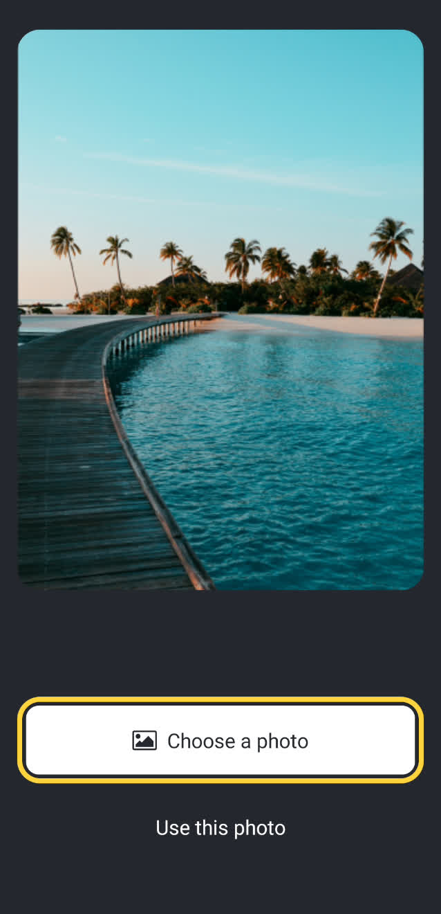
The screen above displays an image and two buttons. The app user can select an image using one of the two buttons. The first button allows the user to select an image from their device. The second button allows the user to continue with a default image provided by the app.
Once the user selects an image, they'll be able to select and add a sticker to the image. So, let's get started creating this screen.
1
Break down the screen
Before we build this screen by writing code, let's break it down into some essential elements. Most of these elements directly correspond to the built-in Core Components from React Native.
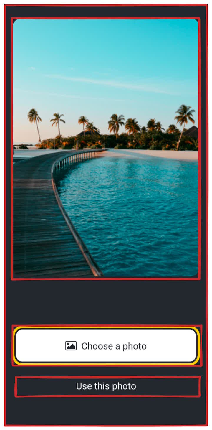
There are three essential elements:
- The screen has a background color
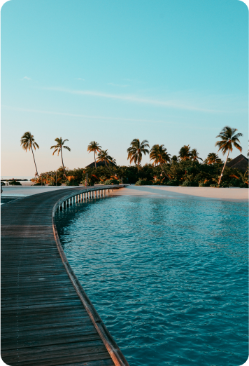
- There is a large image displayed at the center of the screen
- There are two buttons in the bottom half of the screen
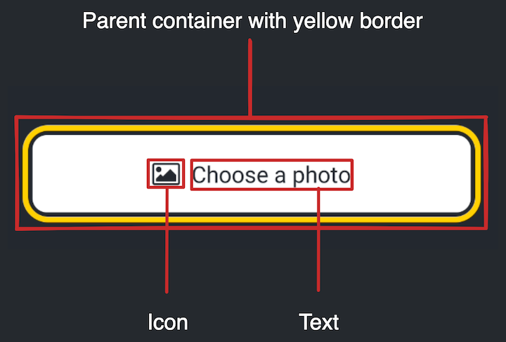
The first button is composed of multiple components. The parent element provides a yellow border and contains an icon and text components inside a row.
In React Native, styling (such as the yellow border) is done using JavaScript as compared to the web, where CSS is used. Most of the React Native core components accept a style prop that accepts a JavaScript object as its value. For detailed information on styling, see Styling in React Native.
Now that we've broken down the UI into smaller chunks, we're ready to start coding.
2
Style the background
Let's change the background color. This value is defined in the styles object in the App.js file.
Replace the default value of #fff with #25292e for the styles.container.backgroundColor property. It will change the background color of the screen.
import { StatusBar } from 'expo-status-bar';
import { StyleSheet, Text, View } from 'react-native';
export default function App() {
return (
<View style={styles.container}>
<Text>Open up App.js to start working on your app!</Text>
<StatusBar style="auto" />
</View>
);
}
const styles = StyleSheet.create({
container: {
flex: 1,
backgroundColor: '#25292e',
alignItems: 'center',
justifyContent: 'center',
},
});
React Native uses the same color format as the web. It supports hex triplets (this is what
#fffis),rgba,hsl, and a set of named colors likered,green,blue,peru, andpapayawhip. For more information, see Colors in React Native.
3
Change the text color
The background is dark, so the text is difficult to read. The <Text> component uses #000 (black) as its default color. Let's add a style to the <Text> component to change the text color to #fff (white) in App.js.
import { StatusBar } from 'expo-status-bar';
import { StyleSheet, Text, View } from 'react-native';

export default function App() {
  return (
    <View style={styles.container}>
      <Text style={{ color: '#fff' }}>
        Open up App.js to start working on your app!
      </Text>
      <StatusBar style="auto" />
    </View>
  );
}

%%placeholder-start%%const styles = StyleSheet.create( %%placeholder-end%%const styles = StyleSheet.create({
  container: {
    flex: 1,
    backgroundColor: '#25292e',
    alignItems: 'center',
    justifyContent: 'center',
  },
});
4
Display the image
We can use React Native's <Image> component to display the image in the app. The <Image> component requires a source of an image. This source can be a static asset or a URL. For example, the source can be required from the app's ./assets/images directory, or the source can come from the Network in the form of a uri property.
Next, import and use the <Image> component from React Native and background-image.png in the App.js. Let's also add styles to display the image.
import { StatusBar } from 'expo-status-bar';
import { StyleSheet, View, Image } from 'react-native';

const PlaceholderImage = require('./assets/images/background-image.png');

export default function App() {
  return (
    <View style={styles.container}>
      <View style={styles.imageContainer}>
        <Image source={PlaceholderImage} style={styles.image} />
      </View>
      <StatusBar style="auto" />
    </View>
  );
}

const styles = StyleSheet.create({
  container: {
    flex: 1,
    backgroundColor: '#25292e',
    alignItems: 'center',
  },
  imageContainer: {
    flex: 1,
    paddingTop: 58,
  },
  image: {
    width: 320,
    height: 440,
    borderRadius: 18,
  },
});
The PlaceholderImage variable references the ./assets/images/background-image.png and is used as the source prop on the <Image> component.
5
Dividing components into files
As we add more components to this screen, let's divide the code into multiple files:
- Create a components directory at the root of the project. This will contain all the custom components created throughout this tutorial.
- Then, create a new file called ImageViewer.js, inside the components folder.
- Move the code to display the image in this file along with the
imagestyles.
import { StyleSheet, Image } from 'react-native';

export default function ImageViewer({ placeholderImageSource }) {
  return (
    <Image source={placeholderImageSource} style={styles.image} />
  );
}

const styles = StyleSheet.create({
  image: {
    width: 320,
    height: 440,
    borderRadius: 18,
  },
});
Next, let's import this component and use it in the App.js:
import { StatusBar } from 'expo-status-bar';
import { StyleSheet, View } from 'react-native';

import ImageViewer from './components/ImageViewer';

const PlaceholderImage = require('./assets/images/background-image.png');

export default function App() {
  return (
    <View style={styles.container}>
      <View style={styles.imageContainer}>
        <ImageViewer placeholderImageSource={PlaceholderImage} />
      </View>
      <StatusBar style="auto" />
    </View>
  );
}

%%placeholder-start%%const styles = StyleSheet.create({ %%placeholder-end%%const styles = StyleSheet.create({
  container: {
    flex: 1,
    backgroundColor: '#25292e',
    alignItems: 'center',
  },
  imageContainer: {
    flex: 1,
    paddingTop: 58,
  },
});
6
Create buttons using Pressable
React Native provides various components to handle touch events on native platforms. For this tutorial, we'll use the <Pressable> component. It is a core component wrapper that can detect various stages of interactions, from basic single-tap events to advanced events such as a long press.
In the design, there are two buttons we need to implement. Each has different styles and labels. Let's start by creating a component that can be reused to create the two buttons.
Create a new file called Button.js inside the components directory with the following code:
import { StyleSheet, View, Pressable, Text } from 'react-native';

export default function Button({ label }) {
  return (
    <View style={styles.buttonContainer}>
      <Pressable style={styles.button} onPress={() => alert('You pressed a button.')}>
        <Text style={styles.buttonLabel}>{label}</Text>
      </Pressable>
    </View>
  );
}

const styles = StyleSheet.create({
  buttonContainer: {
    width: 320,
    height: 68,
    marginHorizontal: 20,
    alignItems: 'center',
    justifyContent: 'center',
    padding: 3,
  },
  button: {
    borderRadius: 10,
    width: '100%',
    height: '100%',
    alignItems: 'center',
    justifyContent: 'center',
    flexDirection: 'row',
  },
  buttonIcon: {
    paddingRight: 8,
  },
  buttonLabel: {
    color: '#fff',
    fontSize: 16,
  },
});
Now, in the app, an alert will be displayed when the user taps any of the buttons on the screen. It happens because the <Pressable> calls an alert() in its onPress prop.
Let's import this component into App.js file and add styles for <View> component that encapsulates these buttons:
import { StatusBar } from "expo-status-bar";
import { StyleSheet, View} from "react-native";

import Button from './components/Button';
import ImageViewer from './components/ImageViewer';

const PlaceholderImage = require("./assets/images/background-image.png");

export default function App() {
  return (
    <View style={styles.container}>
      <View style={styles.imageContainer}>
        <ImageViewer placeholderImageSource={PlaceholderImage} />
      </View>
      <View style={styles.footerContainer}>
        <Button label="Choose a photo" />
        <Button label="Use this photo" />
      </View>
      <StatusBar style="auto" />
    </View>
  );
}

const styles = StyleSheet.create({
  %%placeholder-start%%// Styles that are unchanged from previous step are hidden for brevity. %%placeholder-end%%container: {
    flex: 1,
    backgroundColor: '#25292e',
    alignItems: 'center',
  },
  imageContainer: {
    flex: 1,
    paddingTop: 58,
  },
  footerContainer: {
    flex: 1 / 3,
    alignItems: 'center',
  },
});
Let's take a look at our app on Android, iOS and the web:
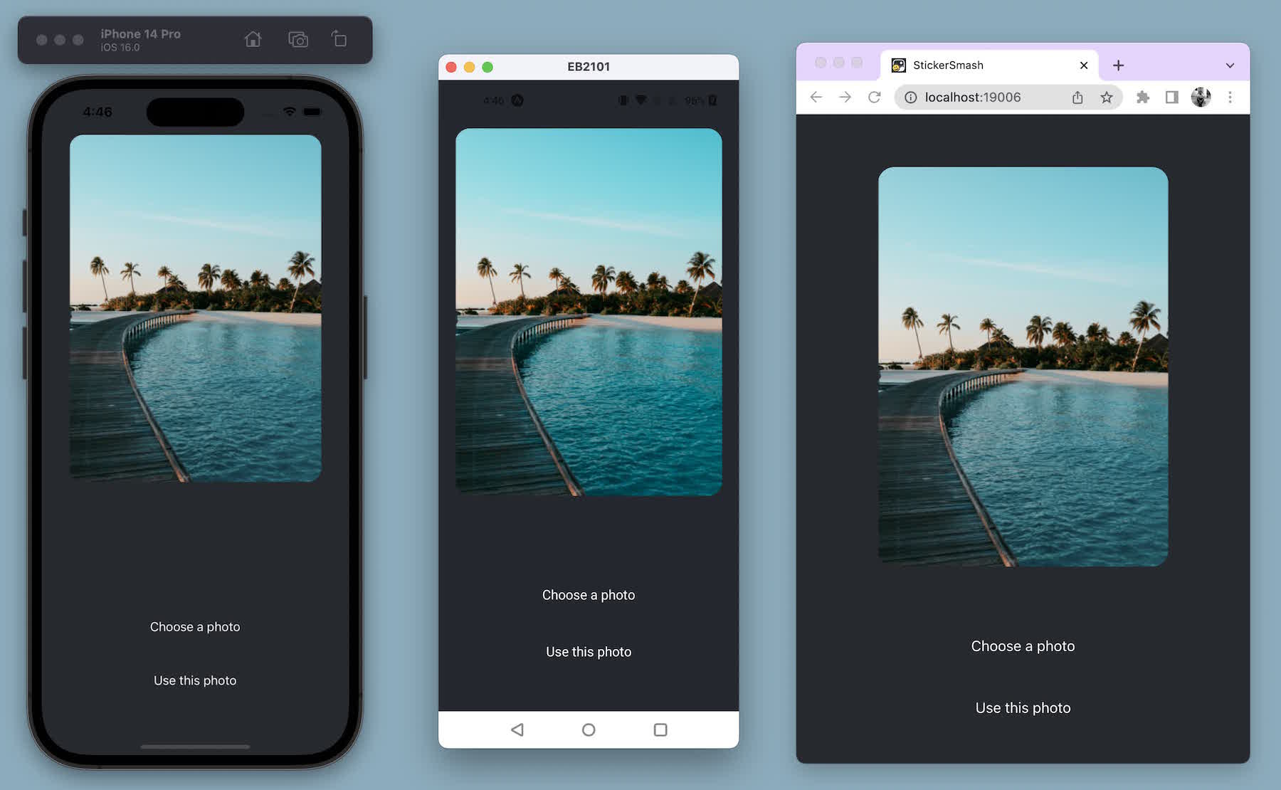
The second button with the label "Use this photo" resembles the actual button from the design. However, the first button needs more styling to match the design.
7
Enhance the reusable button component
The "Choose a photo" button requires different styling than the "Use this photo" button, so we will add a new button theme prop that will allow us to apply a primary theme.
This button also has an icon before the label. We will use an icon from the @expo/vector-icons library that includes icons from popular icon sets.
Stop the development server by pressing Ctrl + c in the terminal. Then, install the @expo/vector-icons library:
- npx expo install @expo/vector-iconsThe npx expo install command will install the library and add it to the project's dependencies in package.json.
After installing the library, restart the development server by running the npx expo start command.
To load and display the icon on the button, let's use FontAwesome from the library. Modify Button.js to add the following code snippet:
import { StyleSheet, View, Pressable, Text } from 'react-native';
import FontAwesome from "@expo/vector-icons/FontAwesome";

export default function Button({ label, theme }) {
  if (theme === "primary") {
    return (
      <View style={[styles.buttonContainer, { borderWidth: 4, borderColor: "#ffd33d", borderRadius: 18 }]}>
        <Pressable
          style={[styles.button, { backgroundColor: "#fff" }]}
          onPress={() => alert('You pressed a button.')}
        >
          <FontAwesome
            name="picture-o"
            size={18}
            color="#25292e"
            style={styles.buttonIcon}
          />
          <Text style={[styles.buttonLabel, { color: "#25292e" }]}>{label}</Text>
        </Pressable>
      </View>
    );
  }

  return (
    <View style={styles.buttonContainer}>
        <Pressable style={styles.button} onPress={() => alert('You pressed a button.')}>
          <Text style={styles.buttonLabel}>{label}</Text>
        </Pressable>
      </View>
  );
}

const styles = StyleSheet.create({
  // Styles from previous step remain unchanged.
});
Let's learn what the above code does:
- The primary theme button uses inline styles which overrides the styles defined in the
StyleSheet.create()with an object directly passed in thestyleprop. Inline styles use JavaScript. - The
<Pressable>component in the primary theme uses abackgroundColorproperty of#fffto set the button's background color. If we add this property to thestyles.button, then the background color value will be set for both the primary theme and the unstyled one. - Using inline styles allows overriding the default styles for a specific value.
Now, modify the App.js file to use the theme="primary" prop on the first button.
export default function App() {
  return (
    <View style={styles.container}>
      <View style={styles.imageContainer}>
        <ImageViewer placeholderImageSource={PlaceholderImage} />
      </View>
      <View style={styles.footerContainer}>
        <Button theme="primary" label="Choose a photo" />
        <Button label="Use this photo" />
      </View>
      <StatusBar style="auto" />
    </View>
  );
}
Let's take a look at our app on Android, iOS and the web:
Next step
We implemented the initial design.
In the next chapter, we'll add the functionality to pick an image from the device's media library.